Why Are My Food Label Printed Colors Different From My Artwork?
Learn why food label colors may look different from your artwork and how color management, materials, printing methods, and proofing help achieve consistent results.
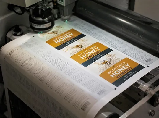
One of the most common questions we hear from customers is:
"Why don't my printed food labels look exactly the same as the design on my computer screen?"
For many brands, this can be a frustrating experience.
The artwork looks perfect on the designer's monitor. The colors appear bright, balanced, and exactly as expected. However, when the labels are printed, the final result may look slightly different.
At first, some customers may think the printing quality is the problem.
But in reality, color differences between artwork and printed labels are usually caused by multiple factors working together.
The journey from a digital design file to a physical label involves many variables:
- Screen display settings
- Color modes
- Label materials
- Printing technology
- Ink performance
- Production control
- Proofing process
A professional label manufacturer understands these differences and helps customers manage expectations before production begins.
Because achieving consistent color is not just about printing a file.
It is about controlling the entire process.
Your Screen Color Is Not Always the Same as Printed Color
One of the biggest reasons for color differences is the difference between digital screens and physical printing.
Computer monitors display colors using RGB (Red, Green, Blue).
Printing systems typically use CMYK (Cyan, Magenta, Yellow, Black) or other ink-based color systems.
These two methods create colors in completely different ways.
A screen produces light to create bright colors, while printed labels rely on ink reflecting light.
This means some colors that look vivid on a monitor may not be reproduced exactly on a physical label.
Other factors can also affect what you see on screen:
- Monitor calibration
- Brightness settings
- Screen quality
- Color profile settings
This is why professional printing requires proper file preparation and color management before production.
The goal is not to make the printed label look identical to every computer screen.
The goal is to create a predictable and controlled color result.
Label Materials Can Change How Colors Appear
Even with the same artwork file and printing process, different label materials can produce different color results.
The label surface affects how ink appears.
For example:
- Paper labels may absorb ink differently
- Film labels may create brighter colors
- Transparent labels may change the appearance because the background affects the final color
- Gloss lamination may increase color intensity
- Matte finishes may create a softer appearance
A design created for one material may not look exactly the same when printed on another.
This is especially important for food brands that care about packaging appearance.
Choosing the correct material is part of achieving the desired color result.
Printing Equipment and Color Control Affect Consistency
Professional label printing requires more than simply sending artwork to a machine.
Printing equipment needs proper calibration and color management to maintain consistency.
Factors that can influence printed colors include:
- Equipment calibration
- Ink characteristics
- Printing settings
- Production conditions
- Different production batches
A reliable label manufacturer uses standardized processes to reduce unnecessary color variations.
This may include:
- Color calibration
- Digital color management
- Production monitoring
- Quality checks
Different Printing Methods Can Create Different Color Results
The printing method itself also affects color performance.
Different technologies have different strengths.
Digital printing is often ideal for:
- Small quantity orders
- Multiple SKUs
- Product testing
- Faster production changes
Flexographic printing is often used for:
- Large volume production
- Long-term repeat orders
- High-speed manufacturing
Brands also need to consider the difference between:
- CMYK printing
- Spot colors
Choosing the correct printing method before production can significantly improve color expectations.
Why Color Proofing Is Important Before Mass Production
For brands with strict color requirements, approving a sample before full production is one of the most effective ways to avoid surprises.
A screen preview cannot fully represent the final printed result.
Professional proofing allows customers to evaluate:
- Actual printed colors
- Label material appearance
- Finishing effects
- Overall packaging appearance
For customers with high color expectations, confirming a printed sample before moving into mass production is always a smart decision.
A few hours spent reviewing a proof can prevent much bigger problems later.
Choosing the Right Printing Method Makes a Difference
Not every project needs the same approach.
For customers ordering large quantities and requiring strict color matching, a proofing and approval process is highly recommended.
However, for smaller orders, digital printing is often a practical solution.
Digital printing offers:
- Lower setup requirements
- Better flexibility for small quantities
- Consistent results for short runs
- Cost advantages for testing and multiple SKUs
The best printing solution depends on the customer's quantity, color requirements, and application needs.
Final Thoughts
Color differences between artwork and printed food labels are common, but they can be managed.
The final color result depends on many factors, including screen settings, label materials, printing technology, production control, and proofing procedures.
For brands that require highly accurate colors, confirming a printed sample before mass production is always a smart decision.
For smaller orders, digital printing provides a flexible and cost-effective option with stable color performance.
A successful label is not only about creating beautiful artwork.
It is about making sure that artwork can be transformed into a consistent physical product.